An organizational rebrand can be one of the most effective strategies to increase customer engagement and market your business. As discussed in the Level Up series, companies like PayPal have rebranded successfully multiple times over recent years. But what happens when a rebrand goes wrong?
Today, we’ll be learning from a rebrand that didn’t go well. And we won’t just be looking at a general rebrand. Specifically, we’ll be looking at a color rebrand that was unsuccessful. The point is to deepen our understanding of color in branding and how to use it in a rebrand and avoid costly hindrances and mistakes. This article is part of the series of articles sharing Color Concepts that can help boost your brand.
What happens when a rebrand fails?
Unsuccessful rebrands can hamper growth and have lasting ramifications, such as audience distrust, low sales, and poor customer/client interaction.
If you’re considering a rebrand or would like to analyze your current branding (particularly colors), this article will help you understand where a company may go wrong in the rebranding process. By analyzing this, you can hopefully avoid making similar mistakes.
How poor color selection can hurt a rebrand
Did you know that people make buying decisions based on color alone? Color is ingrained in how we make decisions, judgments, and assessments. It’s a psychological, emotional aspect of who we are. This cannot be ignored when branding – or in this case – rebranding.
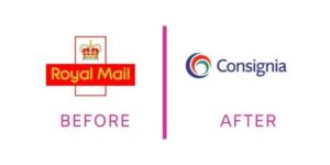
Although not a recent rebrand, it’s such a good example of color gone wrong that it’s still relevant today. In 2001, the United Kingdom’s mail system (the equivalent of USPS -United States Postal Service), rebranded from their well-established, distinguished logo and color scheme of red and yellow to not only a different name, but a totally different color scheme of blue, red, and green. Because we’re talking about color and rebranding, we’re going to get visual. After all, there’s no better way to understand than to see. Here’s a visual of the two logos:

The color palette Royal Mail had before, solid red with yellow, symbolizes warmth, approachability, and social engagement. Red, being the dominant color, communicates action and strength. These are all traits that convey trust. For an organization that handles billions of letters and parcels every year, trust is the most important trait for them to embody. People need to know they can rely on the service to get their mail safely to its destination.
Being a power color, red often needs to be paired with another color to provide a balance. Royal Mail accomplished this with yellow, which can communicate optimism. But they didn’t use too much yellow, as too much of it can communicate fun, young ideas, which Royal Mail doesn’t want to communicate. So instead, red was dominant and the yellow was only in the text and crown image of their logo.
So, what happened when they ditched their color scheme entirely? Disaster happened. Customers were confused by the new brand. They didn’t understand what happened to the visuals they had come to know and trust. The new logo, name, and colors looked colder, more corporate. Royal Mail received harsh criticism from the public and private sectors for such a radical change that didn’t align with their organization.
This rebrand gone wrong ended up costing Royal Mail more than they’d bargained for. Just a little over a year after this failed rebrand, they reverted to their original branding. The cost? Time, energy, and over 1 million pounds (at the time, close to $2 million dollars).
Why color selection is crucial to your branding
Color is a visual tool you can use to make an immediate connection with your customers. It impacts buying decisions. And this isn’t speculation. The impact and psychology of color have been studied and proven through the ages.
Color distinguishes you from the competition in the marketplace. People identify your business by the colors that represent it. In the case of Royal Mail, they had become known for that bold red and yellow. This had become their visual identity. To make such a radical change to completely opposing colors was confusing to their customers and partners.
As detailed in the Lane Jones Branding Framework, the impact of effective, purposeful branding is audience connection.
So, what should you consider when choosing your brand color palette
What colors would your customers/clients be attracted to? Now, it’s obvious that you won’t be able to guess this 100% of the time. But there’s a psychology behind colors, what we like and don’t like, what we’re attracted to and turned off by. The more you know your audience, the easier it will be to have an idea of possible color palettes to choose from.
Once you’re sure about a few colors (either the ones you’re already using or a few you are considering), your next step is to narrow down and pick one dominant color. This is where the color branding magic happens. In the case of Royal Mail, it was red. Your dominant color is your main communicator. From there, you can choose another color (or maximum, 2 other colors) to balance with your dominant one.
We learned a lot form Royal Mail’s unfortunate rebrand failure. Namely, the importance of maintaining the successful images, messages, and colors your organization is known for. There are times you may need to rebrand and times you need to stick with what’s working.
If you do choose to rebrand, follow the principles highlighted in this post and avoid branding mistakes that can cost you customers, trust, and unnecessary time and money.
Ready to kickstart your successful rebrand today? I offer comprehensive color branding consulting and strategy. Get in touch and find out how I can help give your brand and business a boost.
